Tuesday, November 28, 2017

The Etceterini Files Part 12: Virgilio Conrero, Tuner or Hot Rod Maestro?

The world of etceterini was animated by tuners, enterprising and improvising mechanics that Americans would call hot rodders, as well as some true car manufacturers, albeit at a small scale. In the case of Virgilio Conrero, it's difficult to say where one description fades into another, but it's not so difficult to appreciate his work.  Born in Turin in the last year of World War I, Conrero served as an aircraft mechanic during World War II and started Conrero Autotechnica in 1951. He began by tuning Alfa Romeos, and was just in time to capitalize on the launch of the new 1900, Alfa's first mass-produced car.  Soon he was putting his own personal stamp on race cars such as this 1953 Conrero Alfa 1900, which marked the first appearance of Ghia's "Supersonic" body style...

The sleek, low-roofed design by Giovanni Savonuzzi referred to the world of aircraft in details like the fins, jet exhaust-shaped tail lights and transparent roof.  In the photo above, the car takes off on its ill-fated run in the 1953 Mille Migia, Italy's legendary thousand-mile race on public roads. The car crashed, but not before attracting a lot of attention, which led Ghia to build versions of this body on Fiat 8V, Aston Martin and Jaguar chassis.


It may be appropriate that the Supersonic outfit wound up clothing several different makes of car, because under the skin Conrero's Supersonic was already several makes. The tubular chassis designed by Conrero featured a Fiat 1400 front suspension, while the twin- cam Alfa Romeo 1900 inline four sent power to the rear wheels through a transaxle sourced from a Lancia Aurelia.


During that same year, Conrero produced this Alfa 1900 Sport below, with right-hand drive and bodywork reminiscent of Vignale's Ferrari spiders from the same era. The simple grille design, with concave vertical bars, would appear on some Zagato-bodied Fiat 8V coupes which would compete with Conrero Alfas in the 2 liter class...


Throughout the 1950s more competition spiders appeared; some, like the 1957 example below, featured the traditional Alfa grille shape.  The coachwork supplier was not credited, but the body was in alloy on a tubular chassis.


By the time the Sixties arrived, Conrero's racers had made enough of a mark that Standard Triumph approached the Italian firm to design a trio of racing coupes for Le Mans.  These were to use the twin-cam Triumph Sabrina inline four which had appeared in the TRS racers at Le Mans in 1959...by accident or design, Conrero seems to have become a specialist in coaxing more performance out of two-liter inline fours. The body design was by Giovanni Michelotti, and it was built in alloy over a tubular chassis with a disc brake at each corner...


Only one example, the purposeful green car above, was completed in 1962 before budget-conscious Triumph management cancelled the program.  Tested on the M1 motorway, the 165 hp Conrero Triumph managed nearly 150 mph.  It never made the starting grid at Le Mans, but was sent to the States with some other Sabrina-powered racers, and is now being restored in England. The aerodynamic nose would have presented an appealing face if it had been allowed to influence the conservative company's production cars.

                                                   
The Conrero Alfa Romeo Goccia from 1961, also designed by Giovanni Michelotti, displays a similar concern for slippery passage through the air. Unlike the Conrero Triumph, the Goccia (Italian for teardrop, and pronounced "gotcha") was not part of an official factory racing program. By 1961, Zagato was already bodying Alfa Romeo Giuliettas for racers and rally drivers, and these were offered through Alfa dealers.  Conrero had, however, started modifying the alloy block Alfa 1300 engines, offering some with twin-plug heads before Alfa got around to that, with alternative displacements of 1100 or 1500 cc.  The Goccia was based on a 1957 Giulietta spider chassis, with 4 speed gearbox, and claimed a top speed of over 130 mph. 


By 1965 Conrero had built an Alfa-based Le Mans spider with a Giulietta-based engine with displacement reduced to 1100 cc.  It featured sparse, low-drag bodywork in light alloy, and an independent rear suspension with inboard rear brakes, all in a tubular chassis to Virgilio Conrero's design.  During this period, Conrero also began to work on Simca and Renault engines. 


In 1970, shortly after the appearance of the Opel GT from GM's German division, Conrero began tuning and preparing Opels for competition.  As at the beginning, Conrero was again working on coaxing race-winning performance from a 1.9 liter inline four. In the first year, the Conrero Opel GT won its first race in the Italian Touring Car series.  Conrero-modified 4 and 6 cylinder Opels continued to find success in European rallying and touring car racing through 1987.  Virgilio Conrero died in 1990, but his firm continued its work modifying and tuning Opel race cars until 1997, making it one of the longest-lived of the Italian competition specialists.


Photo Credits:

Top through 3rd:  coachbuild.com
4th: mossmotoring.com
5th: pinterest.com
6th & 7th:  mossmotoring.com
8th: classicdriver.com
9th: Phil Ward
10th & 11th:  Auto Italiana Magazine
12th: conrero.com (official company site)


Wednesday, November 22, 2017

Denver Solar Decathlon 2017: World's Fair for Future Architects

The Department of Energy defines the idea behind the Solar Decathlon on their website: "The U.S. Department of Energy Solar Decathlon is a collegiate competition made up of 10 contests that challenge student teams to design and build full-size, solar-powered houses..." The first Solar Decathlon was held in 2002, and the next in 2005; they've appeared every two years since. One potential area of improvement the Decathlon organizers might want to consider is to locate each exhibition close to a city center, so that it attracts more traffic and exposes more potential housing consumers to its ideas. One understands the difficulty of finding enough open land close to the center of a booming city like Denver, but the long trip out to outlying site may have discouraged a few visitors.  At least it was accessible by the new airport train, and rewarded show-goers with a provocative display of new ideas...


On a windy day in early October, the 2017 Solar Decathlon site near Denver International Airport had the feel of a mini world's fair for future architects.  Student teams from all over the United States vied with competitors from Switzerland and the Netherlands to provide an overall building design best meeting the goals of innovative design, energy production and efficiency, sustainable use of water and materials, and marketability.  The overall winner was selected from a field of eleven houses displaying a varied mix of inventiveness in concept, use of technology and deployment of materials and fixtures.  


Even with a full house on a partly cloudy day, Missouri University of Science and Technology (MUST; we have entered an exhibit where acronyms rule) hosted a house with a spacious, sunny feel to it.  The SILO (Smart Innovative Living Oasis) shown above and below was aimed at empty nesters, but could easily be adapted to use by a small family. Outside, the white batten siding echoes old farm houses, but the solar power, energy storage, and computerized controls aim at net-zero energy use, and are as modern as the glassy living space with curved, vaulted roof.  


The CRETE house from the Washington University team in St. Louis advanced the sustainability of concrete as an alternative to more traditional (i.e., wood frame) types of construction. The house was assembled on site from factory-built insulated precast concrete panels, and features a hydroponic system fed by large concrete water carriers (one hesitates to call them gutters) which form vertical and horizontal planters.  This system also provides a built-in relationship between the architecture and landscape, and the construction system provides a sometimes-underrated environmental benefit: durability. The house is designed to last a century...


Wood surfaces warm up the kitchen, while the bright metal lighting and air handling raceway spanning the ceiling unifies and illuminates the space.  The living and dining room is cleanly organized and concise, but that concrete wall could use some paintings or photos to bring it all home...


The NeighborHub house, the Swiss team's entry shown below, represented 4 schools and 3 towns*, and proposed flexible functions allowing as a community center with meeting rooms and bike repair shop, as well as a community garden. Movable wall panels include passive solar as well as PV functions, provide shade and access, and border an aquaponic growing space. Featuring reconfigurable space aimed at maximizing potential uses on a small parcel of land, and placing the value of community at the heart of the design, NeighborHub was the overall winner of this year's Decathlon.


University of Nevada's team gave their house a Sinatra Living theme. This is perhaps not a surprise as the design intends to serve the growing pool of citizens (senior and otherwise) who aim to retire in Las Vegas.  The exterior form takes many of its cues from the sleekly modern homes which appeared in Las Vegas and Palm Springs in the 50s and 60s...


The Nevada team met with a team from AARP to insure that the Sinatra design met their themes of accessibility and healthy living.  Interiors emphasize open flow of space, with adjustable counter tops.  Wood surfaces lend visual warmth to walls and ceilings...


Energy efficiency is addressed with south-facing PV cells bordering the broad, shaded outdoor living space...


The Enable house shown below was designed by the Northwestern University team to provide an adaptable, accessible habitation which would perform efficiently in Chicago's weather extremes. Designed around passive solar principles with PV cells integrated into a sloping roof surface, the Enable project is constructed of structural insulated panels and features energy recovery ventilation along with air quality monitoring.


Responding to a program aimed at convenient "aging in place", the designers provided a large sun room, wide interior and exterior openings with sliding doors, and layout of interior walls which can be easily reconfigured to meet the changing needs of the users.  The sloping ceiling below the photovoltaic roof leads to a north-facing clerestory which admits light without glare...


The University of Maryland team designed the "reACT" dwelling below for members of the Nanticoke Indian Tribe. The theme of natural harmony echoes tribal traditions and is approached by an analogy to living organisms, with 6 modules supporting essential functions.  Roof surfaces covered with photovoltaic panels flank the light-filled central space.


Public and private spaces are grouped around a south-facing, passive solar atrium with movable vertical gardens deployed along interior walls.  Urban farming is highlighted by the presence of hydroponic and vegetable gardens, as well as a composting system.


The light-filled living and dining space and opens to an energy-efficient kitchen with views of the atrium beyond.  Aided by exemplary performance in categories evaluating energy efficiency, sustainability and use of resources, the Maryland team achieved a solid 2nd place by grounding their efforts in long-ignored Native American values of living in harmony with nature...


*Footnote:  The Swiss entry was one of several joint ventures between different educational institutions, as were entries from Team Alabama, Team Daytona Beach, and the UC Berkeley / U of Denver house which took 3rd place in the competition.  For the final finishing order as well as a complete description with photos of all the entries, you can visit www.solardecathlon.gov/2017.

Photo Credits:

Band of 3 small photos at top shows entries from Switzerland, Maryland, and the joint entry from UC Berkeley and the University of Denver. (US Dept. of Energy / Solar Decathlon).

The CRETE house:  Dennis Schroeder for the DOE.

1st Sinatra Living exterior:  D. Schroeder for DOE.

Northwestern University Enable house exterior:  Ben Lochridge

Maryland reACT house:  Exterior photo by Ben Lochridge, Atrium by Josh Bauer for DOE,
and living space by Dennis Schroeder for DOE.

All other photos are by the author.


Thursday, November 9, 2017

Forgotten Classic: Lincoln Model K, Not Your Average K-Car

Heading for Chicago's western suburbs on side streets to avoid Friday afternoon rush hour traffic, I passed a corner mechanic's shop of the kind that once serviced Everyman's car in the era before national chains took over.  In my Chicago childhood, my dad and I would walk along automobile row, and we'd often see classic cars like Cord 810s and Packard Super 8s sitting in used car lots, their once shiny paint dulled and chrome pitted, forlornly waiting for adoption.  And here on the corner was an image straight out of that childhood...a Lincoln Model K behind a chain-link fence.  I circled the block to have a closer look...


She appeared to be a limousine from no earlier than 1937, as that year the big K Series adopted streamlined teardrop headlight fairings like the junior Lincoln Zephyr line. The blue cloisonné Art Deco emblem announcing the V12 power unit (a 65 degree L-head of 414 cubic inches, making 150 hp) seemed in perfect shape, and all the trim pieces seemed to be there, including the racing greyhound mascot.  Perhaps she had once shuttled politicians or executives to meetings downtown, or wealthy dowagers to the opera...


Back in the days when she had somebody to keep her washed and waxed for her next assignment, she looked more like the car pictured below.  In fact, she may actually be the 1937 car pictured below, right down to the color, the side-mounted spares, and the fog lights fronting the proud Lincoln grille...


Now she waits for somebody to awaken her from her slumbers and put her back into the roadworthy condition she deserves.  She's a rare one; only 977 Model Ks left the factory in 1937, down from 1434 in 1934.  Sales were hurt by the introduction of the lower-priced Lincoln Zephyr in 1936, and by the ongoing Depression, which meant the $4,200-$7,400 price range would've bought a pretty decent house. The Zephyr, with a smaller, initially less-reliable V12 based on the Ford V8, sold ten to twenty times as many cars because of prices 50 to 70 percent lower. The Model K, like the '36 Zephyr and '40 Continental, was a pet project of Edsel Ford, and the basic lines of the standard bodies for these cars was set down by designer Bob Gregorie.  On the Model K, special coach builders also worked their magic, as on the 1937 Touring Cabriolet below, bodied by Brunn.  The small, tinted panes above the windshield were a futuristic touch...


Future design themes also appeared in this 1938 Touring Coupe with special body built in very small numbers by Judkins.  Notice the continuous sweep of glass in those big side windows, predicting the GM hardtop convertibles by over a decade, and echoing the "Vutotal" coupes built by French coach builders like Letourneur et Marchand* at around the same time.  Only 416 Model Ks would be built in 1938, and another 133 in 1939.  In 1940, the year before Pearl Harbor, the line came to an end.  Lincoln would not return to the upper levels of the luxury market until 1956, with the Continental Mark II.


But we will probably return to this corner in Chicago to have a look at other treasures...


*Footnote:  A postwar Letourneur-bodied Delage is featured in the post for April 23, 2016.

Photo credits:

Top, 2nd & 4th from top, and bottom photo:  the author
3rd:  autogallery.org.ru
5th (Brunn Cabriolet): wikimedia
6th:  George Havelka
7th:  pinterest.com
8th:  howstuffworks.com

Monday, November 6, 2017

Chicago: City of Architecture, Film and Ideas, Part 2

Chicago's Architecture Biennial offers tours* as far-ranging as visits to Frank Lloyd Wright's H.C. Johnson Center in Racine, Wisconsin, but there is plenty to see without leaving Chicago. Our first stop was the Chicago Cultural Center at 78 East Washington, looking across Michigan Avenue towards the Frank Gehry-designed band shell, and featuring the indoor exhibits for the Biennial which runs until January 7, 2018. The exhibits are free, and if you get hungry you can cross the street to Toni's Patisserie at 65 E. Washington. 


Inside the Cultural Center, our longest and most engaging stop was prompted by 3 projects on display by Archi-Union, a team of architects from Shanghai.  Showing models as well as photos of completed structures, Archi-Union made a strong impression with an approach combining elemental geometry, structural expression and organically warped surfaces.  An example of the latter is the way the sheer brick wall in the model below grows outward into a form recalling an eyebrow; this form echoes the angled parapet above at the same time it marks the entry.


The model of a structure with figure 8 roof is in the foreground below; the photo in the background is of the completed structure, where the roof is covered with tiles sized and shaped by computer.


The roof is even more striking without the roofing material attached, as the model shows its winding, mobius-like form curving over itself, as well as the clarity of the radiating structural ribs.


An entire gallery dedicated to the re-enactment of the 1922 Tribune Tower competition invites viewers to think about the genesis of form, with some examples echoing the emphasis on structural rigor which prevailed in the Chicago of the 1970s (one thinks of Sears Tower and the John Hancock Building) to the whimsical, impractical approach below, where a riot of forms, components, shapes and colors are stacked into an assemblage with the implication that they could be easily rearranged into another composition...


An architect friend suggested a visit to the Poetry Foundation, and on a day enlivened by crisp autumnal sunshine, we had a look.  The building by John Ronan Architects houses a library with 30,000 volumes, an exhibit gallery, a public performance space and the Foundation's offices, as well as the home of Poetry magazine. Visual intrigue is enhanced by the way the largely transparent building creates a sense of enclosure in the landscaped courtyard by deploying a punched metal screen as a sort of privacy curtain. The screen, which also shields the outer envelope on the street facades, solves a complex problem simply. It also manages the trick of revealing the building's mysteries gradually, avoiding the diagrammatic approach which tells the whole story before you get to the front door.  A poetic solution...


In the past decade or so, Chicago has paid more attention to its namesake river, with the construction of the popular Riverwalk (about which more later) and with two award-winning boathouses on the river designed by Studio Gang, the firm founded by Jeanne Gang, who combines community spirit with a fresh, inclusive approach to design.  Both the Riverwalk and the boathouses, one on the North Side and one on the South, have attracted national attention.  I decided to have a look at the WMS Boathouse at Clark Park, which fronts the Chicago River on Rockwell Street, tucked behind Lane Technical High School.  From the east or west elevations, the buildings have a sawtooth profile which the designers say was inspired by the motions of the rowers who practice on this stretch of river in all but the most forbidding weather.  Harder to capture in photos, but apparent in architectural drawings (here you can visit studiogang.com so we can avoid copyright infringment) is the alternating placement of trusses with "V" or "A" shaped profiles in the east-west direction, creating a series of south-facing clerestories which provide light year-round as well as solar heat in winter.


Another thing these trusses to is provide warped roof surfaces which enliven the interior spaces and provide a dash of complexity which is complemented by the careful use of materials (slate, metal and glass on the exterior, with wood and concrete complemented steel trusses inside).


The WMS Boathouse and the Riverwalk can be seen as part of an urban trend to revisit rivers, harbors and waterfront areas for their ecological value as well as their value as tourist destinations and recreational centers, and this trend has picked up its pace in recent years. In a project presaging that movement by around half a century, Chicago architect Bertrand Goldberg designed Marina City at State Street on the Chicago River in 1959. Completed in 1968, the two 65-story residential towers embodied a number of innovations. First, they incorporated a low, horizontal marina as a podium with restaurant spaces above boat slips, a recognition of the river's potential as a lively part of the urban scene.  Provision of an office block, covered parking in the tower bases*, an auditorium, swimming pool, health club and indoor shops and restaurants provided the option of living and working in a sort of megastructure without needing to experience harsh winter weather...it was, after all, called Marina City. The intent of the complex was also an innovation; it was financed mostly by the Building Service Employees Union as an effort to provide a viable downtown living alternative to the then-prevalent flight to the suburbs.


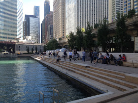
Today you can view Marina City from a pedestrian walkway across the river, on the Riverwalk which was begun in 2001 and constructed in three stages, with design provided by Ross Barney Architects.  On a warm autumn afternoon like this one, you can go fishing, take a boat tour, or idle among the restaurants, shops and bars which line the promenade.


*Footnotes and Facts:  I want to thank Chicago resident and longtime friend Toni Riccardi for hosting and taking pictures at the Biennial show, and architect Charlie Cunov for telling me about the Poetry Foundation.  As this website is entitled Poeschl on Cars, and I was in Chicago during the Film Festival, I cannot resist mentioning that two stunts have been filmed with real cars plunging into the Chicago River from the Marina City parking ramps. One was Steve McQueen's last movie, The Hunter, where a Pontiac Grand Prix crashes into the water.  For an insurance commercial in 2006, an Olds Cutlass tumbles from the 17th floor. You can sign up for building tours involving a lot less risk at the Chicago Cultural Center during the Biennial.

Photo credits:
Top:  the author.
Photos 2 through 6:  Toni Riccardi
Riverwalk at night (bottom):  wikimedia
Remainder of photos:  the author.