Thursday, November 28, 2019

The Etceterini Files Part 21: The Elusive Giannini V8 Follows Urania, Taraschi & Giaur

You may be wondering why we need to expand our history of Giannini cars and engines to include something called the Giaur, and who Urania and Taraschi were.  Well, you couldn't do a very good job of tracing the history of Martha and the Vandellas, for example, if you just concentrated on Martha, so we'll begin with some of what Hollywood calls "back story". Brothers Attilio and Domenico Giannini got into tuning cars for racing early, first with Italas in 1920 and then Fiats in the 1930s. Bernardo Taraschi began building Urania ("heavenly") racers with BMW motorcycle engines after World War II (possibly using engines from abandoned German army motorcycles), but the search for more power led to his partnership with the Giannini brothers, who had begun modifying Fiat 500 engines, then developed their single overhead cam G1.  The photo below shows a BMW-powered, cycle-fendered Urania racer from the late Forties...
One thing led to another, and eventually they were making an all-Giannini G2 engine with aluminum block and twin overhead cams. By the dawn of the Fifties the Giannini-Taraschi partnership was using this engine in Giaur (GIAnnini + URania) cars and Taraschi cars, and later supplied engines to other makers, including Nardi* for the Bisiluro* ("twin torpedo") designed by architect Carlo Mollino* for the 1955 Le Mans. Here the engine is seen installed in the pod opposite the driver's side of the car. The idea was to balance the weight of driver and engine around the longitudinal centerline of the car...
Confusingly, and also because this was Italy, the Giaur combine kept on making Taraschis as well, but now with the same Giannini G2 engine, an example being the Taraschi Sport 750 from 1956 shown below.  It featured a tubular chassis overlaid with alloy bodywork built by Taraschi...
The combine produced a few closed GT cars like the handsome Giaur 750 San Remo Berlinetta shown below, bodied by Rocco Motto* in 1953.  It's a rare example with full road equipment, including tidy bumpers. The proportions, contours and details deftly conceal the tiny size. Production numbers for the Motto body are lost to history, but are bound to be low... 
More typical cars featuring the Giannini power plant included the Giaur 750 Record from 1954-'55. The first photo shows the car with wind-cheating spats over the wheels...
The Giaur 750 is featured in the Museo Giannini, and is shown below without its wheel spats. Overall form is similar to the Taraschi Sport 750 which appeared a year or so later. As with the San Remo Berlinetta, careful handling of proportions conceals the small size of the car, and details like the air intake and trailing edge of the front wheel opening, which are curved in section as well as elevation, impart a sense of mass unlike the fragility sometimes conveyed by road-racing etceterini... 
Outside the limited-production series of Giaur and Taraschi road racers using their own G2 engine, Giannini also offered some tamer cars with lightly modified Fiat pushrod engines during this period. One example is the 1100TV* Fiat Boano Giannini featured below in an ad for Carrozzeria Boano, which designed and built the body in 1956...
In the late Fifties, Formula Junior, restricted to mass-produced engines of no more than 1,100 cubic centimeters, became the favored entry-level racing series for open-wheel, single-seat road racers. Bernardo Taraschi entered the field with this front-engined design with Fiat power. It achieved success on the track and in the marketplace, and Taraschi would eventually build 63 of these Juniors, with 13 going to the United States, making it the most popular single design produced by this group. The year after the 1960 Taraschi shown below was built, the original Giannini partnership broke up, with Attilio founding Costruzioni Meccaniche Giannini, which would concentrate on designing and building prototypes, including engineering for racing engines. Giannini Automobili split off to run the repair facilities and retail outlets.
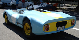
Probably the rarest product of the Giannini Meccaniche operation, and of all Giannini-engined cars, is the V8 produced in 1967. There seems to be no technical information published on the car or engine, not even on the Giannini website, and for awhile it seemed to be the Italian equivalent of cartoonist Bruce McCall's French exotic "La Vume" (voom), "a car so exclusive that none will ever be built."  But these photos of a blue and yellow road racer surfaced recently, and they prove that Giannini, like Abarth* and Bandini*, stayed in the etceterini business long enough to join the mid-engine revolution...
Below is a shot of that engine. As we have not found any specifications, it's not clear whether it was developed from two Giannini twin-cam fours on a common crankcase, or was a completely new design. The displacement was under two liters. There are enough visual differences from small V8s by other Italian makes (Abarth, Alfa Romeo, ATS) to confirm it doesn't borrow from them. So tooling cost per unit produced must have been high indeed...
Fiberglass bodywork showed some similarity to the contemporary Porsche 906 in the shape of the nose and headlight covers, as well as in the placement of the rear fender air intakes and the use of plain, bolt-on wheels...
The design of the tail also echoes contemporary road racer practice, with the turned-up spoiler for added downforce; the license plate may indicate that the car was driven on public roads at some point, maybe to the races...
The financial strain of designing and fabricating race cars like this V8 led to the closing of Attilio's Giannini Meccaniche operation in 1971. Giannini Automobili continued to offer lightly modified Fiat production cars. This aspect of the family business continued into the Eighties, but not without one more effort at making a GT car based upon production components. Partnering with coach builder Francis Lombardi* in early 1968, Franco Giannini, son of Domenico, offered a sleek, low two-seater coupe based upon Fiat 850 floor pans and power trains. The Giannini family formed a joint venture with Lombardi called OTAS (Officina Trasformazioni Automobili Sportive) to make cars for the European and American markets. The rear-mounted pushrod fours were offered in sizes up to 1,000cc in the Giannini Grand Prix for Italian consumption, while the OTAS cars exported to the US featured an 817cc engine to avoid emissions regulations.  Abarth offered a 1,300cc pushrod engine in its Scorpione, and a few of these were imported into the US by California dealer Rich Motors in Southern California. The car shown below is a 1971 OTAS from the Lane Motor Museum in Nashville, Tennessee. The Lombardi-bodied coupes are likely the best known and most frequently seen descendants of the Giannini car family in the USA.  A registry produced by a Lombardi GP owner in 2015 indicated 140 surviving cars of several hundred built. The earlier cars with Giannini-designed G1 and G2 racing engines, and their Urania relatives, are rarer, with 14 Uranias, 48 Giaur and Taraschi sports cars, and 63 Taraschi Formula Juniors, for a total of 125 cars confirmed by the partners.
Since those days, Giannini has been linked closely to Fiat, offering small modifications to regular production cars.  Recently, though, Giannini Automobili has offered something a bit wilder to celebrate the upcoming 100th anniversary of their founding. This is the Giannini 350GP, with a 1.7 liter turbocharged inline 4 from the Alfa Romeo 4C, mid-mounted as in the Alfa, and driving the rear wheels.  The whole ensemble is tucked under a highly modified modern Fiat 500 body, with wide fenders to clear the wheels required to handle the 350 horsepower.  If you live in Europe, you can reconnect with the Giannini tradition for a mere 130,000 Euros...
*Footnote:  In the 21-part (so far) Etceterini Files, we have featured many close relatives of the Giannani and Taraschi cars.  Here's a brief index:  
Nardi Bisiluro:  "Architect Designed Cars Part 1", May 7, 2017
Nardi history: "Etceterini Files Part 14----Enrico Nardi and His Cars: Present at the Creation", Feb. 26, 2018
Rocco Motto: "Unsung Genius: Rocco Mottos, the Closer", March 25, 2018
Fiat 1100TV:  "Etceterini Files Part 9----Plain Old Fiats Plus: 1100TV & 1200TV", Sept. 29, 2016
Francis Lombardi: "Etceterini Files Part 15", Oct. 26, 2018
Abarth: "Etceterini Files Part 13", Jan. 15, 2018
Bandini,  "Etceterini Files Part 8---Bandini, the Art of Endurance", Sept. 18, 2016

Photo Credits:

Top:  pinterest.com
2nd:  dannatavintage.com
3rd & 4th:  squadrataraschi.it
5th:   Giannini Automobili
6th:   automoto.it
7th:   Carrozzeria Boano on classicvirus.com
8th:   AutoMania.it
9th, 11th & 12th:  forum-auto.caradisiac.com  
10th:  retrovisiones.com
13th:  lanemotormuseum.org
14th:  Giannini Automobili

Friday, November 22, 2019

Upstart Challenger: When Pietro Frua Designed a Dodge

For 1969, Elwood Engel's "Fuselage Chryslers" presented a clean alternative to the increasingly baroque big cars from GM and Ford which followed the brief mid-Sixties fashion for clean, trim lines. The Fuselage Chryslers, though oversized like the other "standard sized" Big Three offerings, exhibited mostly undecorated flanks and lots of what designers call "tumble-home", the inward slope of the greenhouse in section.  For the 1970 model year, when Chrysler announced its E-body replacements for the Plymouth Barracuda as well as the first Dodge Challenger, the cars had long-hood, short-deck proportions like the Mustang and Camaro but with more "tumble-home" and also what I call "tuck-under."  Not sure what designers call it, but this is the inward slope of the flanks towards the rocker panels, and it nicely exposed the wider wheels and tires then coming into vogue. 

Unlike GM, which had used the same basic body shells for its Camaro and Firebird twins, Chrysler budgeted for a larger body shell on the Challenger, much as Ford had done for the Mercury Cougar derived from the Mustang.  As a result, the Challenger (above) rode on a 110" wheelbase and was 4.6" longer than the Barracuda* (below) which had 108" between wheel centers. Carl Cameron's design for the Challenger was also 1.2" wider than John Herlitz's Barracuda, and the photo above shows how this aspect was highlighted by the ridge stamped into the Dodge's flanks, running from head to tail lights and following the arc of the rear fenders. The Barracuda shown below highlights the tumble-home as well as the tuck-under of Herlitz's design, which has a more sheer and spare treatment of the flanks than the Challenger. It would look even cleaner without the "shaker" hood scoop and the vinyl roof, which was to the 70s what wraparound, dogleg windshields were to the late 50s. The frontal aspect on the Plymouth may show influence of Giugiaro's designs for the Iso S4 and DeTomaso Mangusta. Car designers, after all, went to shows and read the car mags...


The Barracuda also kept details simple with single headlights (except for 1972) and by offering body-colored front bumpers.  Comparing the Plymouth above with the Dodge below shows how the Challenger's more deeply sculptured flanks generated different shadow lines. Notice how the curve of the Barracuda's rear fender is formed into a distinct ledge below the window sill that fades into the front door stamping.  On the Challenger below, the top of the rear fender actually becomes the window sill, and the side rear window arc follows the roof line, while the Barracuda has a slightly more angular window profile.  These differences were subtle but required expensive tooling for each car line, and showed that the design team must have enjoyed some freedom before the corporate budget-cutters came in.

The budget cutters were in control before 1974, which was the last year for these E-bodies. Declining sales in the "pony-car" sector resulted from increasing insurance rates and concerns about fuel economy which arrived with the Arab oil embargo in '73.  With the passage of time, though, the relative rarity of these cars compared with Mustangs and Camaros, as well as the reputation for performance gained by offering the most extensive engine options (including the 426 Hemi*) meant that the forsaken E-bodies gained fans among collectors. By the time the Daimler-Chrysler marriage ended in 2007, the company had completed designs and tooling for a new Challenger, including key elements like Mercedes S-Class front suspension and E-Class 5-link rear suspension.  The car made its debut in February 2008, and echoed many of the exterior design themes of the original Challenger, such as the roof shape and break line curving along the flanks, here as a simple change of section rather than the incised ridge of the original...

Another difference was that the new car was not a true pillarless hardtop like the original. Despite the presence of that body type in the Mercedes lineup when the new Dodge was planned, designers opted for a conventional B-pillar. And there seemed to be a lot less tumble-home and tuck-under in the new design.  The more vertical sides and roof section are visible in the photo below...

The photo below shows off the more restrained form, perhaps a result of packaging concerns. The decision to go with the B-pillar meant that the space between B and C pillars was filled with a tiny trapezoid of vision glass which is made to look larger by edging it with a black glass border. Despite a few clunky details, the car was convincing on the road, with engine options eventually well beyond the original Hemi's power, the supple Mercedes-derived suspension and modern antilock disc brakes. It sold well, was kept in production after the Fiat takeover of Chrysler in 2009, and is still in production...
If Fiat had been looking for a Challenger design to remind them a bit more of home, they might have had a look at the 1971 Challenger shown below, as it was rebodied by Italy's Pietro Frua*, better known for work on products from Maserati, BMW* and Monteverdi*...
The handsome fastback has plenty of tumble-home as well as tuck-under. Just look at the way it displays those deep wire wheels, which were already becoming an anachronism in 1971 but still look great. The crease linking the front air intake with the tail creates the border between tumble-home and tuck-under, provides a dramatic shadow line and also gives an excuse to animate the wheel arches with those flared openings. On a car where there's almost no surface decoration, these deft maneuvers give the form real impact.
Note also that like the 2007 Challenger, the Frua version has a B-pillar. Unlike it, the car offers real vision between B and C-pillars, as well as out the generous rear hatch. The tail lights appear to have been taken from a period Alfa Berlina, but like everything else, they work.  If Fiat Chrysler decides to go Retro again when they redesign the current Challenger, they could look in worse places than here...
*Footnotes: For a history of another Frua-designed, Chrysler-powered car, see "The Etceterini Files Part 20---Monteverdi and MBM" from July 19, 2019.  Other designs by Frua are featured in "Forgotten Classics: Frua Designs for Hans Glas and BMW" from Dec. 2, 2018. For another look at the Plymouth Barracuda, as well as Ghia-bodied Chrysler show cars, see "What Defines a Production Car, and Why Would Anybody Pay $3 Million for One?" in the Archives for August 29, 2015. 

Photo Credits:
Top thru 3rd from top:  Chrysler Corporation
4th thru 6th:  Fiat Chrysler Automobiles
7th:  en.wheelsage.org
8th & 9th:  webcarstory.com


Saturday, November 16, 2019

Roadside Attraction: The American Gas Station Part 2, Architect Visions

During the boom in gasoline station construction that happened between the advent of mass produced cars and the Great Depression, the building type attracted the attention of architects. Below is a model of a gas station proposed by Frank Lloyd Wright for Buffalo, New York in 1927. The cantilevered copper-covered roof became a Wright trademark during his Usonian period, which began a good decade later.  Wright thought that gas stations, like train stations, might become social gathering places, and provided a lounge at the top level, along with the usual restrooms.  One unusual feature was that the gasoline was delivered from overhanging lines suspended from the roof.  This was intended to avoid the hazard of cars hitting the pumps, but introduced another hazard in the form of gasoline lines running overhead.  Wright's original idea, gravity-fed pumps, would have put the tanks up there too. You might think that someone has crafted a highly detailed miniature Cord L-29 roadster and Pierce Arrow sedan to go with the little station, but you'd be wrong. This model of Wright's first gas station, never built as a functioning building, is full-size, and is located inside the Buffalo Transportation Pierce Arrow Museum.
By the time Wright designed the Lindholm station below in Cloquet, MN as part of his Broadacre City scheme, the suburban model of development, fast food, and even faster stops for gas were the order of the day.  Nevertheless, Wright provided a 2nd floor lounge sheltered by his cantilevered hipped roof, and plunked a spire-like totem on the roof to echo the taller, better-integrated ones atop the stillborn Buffalo station. The signage was not designed by Wright, and is not a happy addition...
The shot below gives a better sense of the decorative patterning along the fascia and the Flash Gordon, rocket-like base of the totem. This design was, after all, produced at the dawn of the Space Age in 1956. The multiple garage doors, usually avoided by Wright, are a reminder that back in the 1950s gas stations were also service stations.
Chicago architect Bertrand Goldberg* designed a predictive gas and service station for the corner of Clark and Maple in that city in 1937, and it was built the next year. Owing to low bearing capacity in the soil (it's a surprise that geotechnical reports were made for gas stations in 1937) Goldberg decided to minimize weight with floor-to-ceiling glass walls and a roof supported by twin masts and steel cables.  This simplified the foundation system and offered the added benefit of putting the retail and service operations on display.  Like other, later glass and steel Chicago buildings (those by Mies van der Rohe for example) there was a downside; the building was more expensive to heat and cool. The design, however, prompted better sales than the client had expected, probably helped by the neon sign that left no doubt about the product on offer...
The daylight shot below shows off those supporting masts in a way that the night view misses. The masts were predictive too, but not of future gas station design. Instead, rival architecture firm Skidmore Owings and Merrill used the idea of twin masts to support the roof on their similarly transparent, but enormous, main structure for Baxter International in the 1970s. Ironically, after working for Bertrand Goldberg Associates for a year, I did some space planning at this Baxter HQ in suburban Chicago, but never had any idea that the genesis for the roof supports in the glassy, spacious cafeteria where I frequently ate lunch had possibly been a humble gas station which has now sadly been replaced with a bigger, less-inventive building...
After decades of declining design quality in gas station design which paralleled suburban sprawl and also the de-emphasis on service in favor of self-service gas and junk food sales, the 21st century has brought a mini-revival in gas station architecture.  It's almost as if the designers, aware of the sales growth for hybrid cars (and predicted boom in electrics), decided to focus on show-business to increase sales of food and other products. In the case of Pops Arcadia Soda Ranch in Arcadia, Oklahoma, Elliot + Associates Architects integrated form and structure with a 100 foot cantilevered roof which covers the restaurant, soda bar and retail interior as well as sheltering the pumps...
Transparent glass walls display hundreds of soda options to the world beyond the windows, while at the roadside, the architects have elected to supplant the usual boring sign on a pole with a 66 foot tall, 4 ton bottle of soda, complete with straw emerging from the top...
The designers made the most of the giant, self-illuminating soda bottle by programming color changes into the scheme. The bottle, possibly a descendent of the totems that appeared on Wright's gas stations, introduces a bit of whimsy into the whole business of stopping for gas and refreshments.
The LED illumination is programmed to provide a light show of constantly changing hues and tones.  As advertising and tongue-in-cheek humor, the Big Bottle seems related to Pop Art (think of Claes Oldeburg's big soft hamburgers) as well as to the earlier tradition of oversized roadside attractions: ice cream stands shaped like giant milk cans, for example*.
In 2007, the same year as Pops Arcadia appeared, Boston's Office dA and LA's Johnston Marklee Architects realized their design for Helios House, a landmark station on Olympic Boulevard in Los Angeles. Given the improbable assignment of recasting the gas station in environmentally-friendly terms, the design team produced a shelter made of triangular recycled stainless steel plates, integrated a rainwater collector to water the landscaping, provided 90 PV panels to reduce energy consumption, and submitted their station for LEED certification, a first. The station began by selling BP gasoline during the period when the company was trying to re-brand itself as "Beyond Petroleum", an advertising campaign environmental groups branded as "greenwashing."  This criticism began to sting in 2010, the year of BP's fatal Deepwater Horizon oil platform disaster in the Gulf of Mexico, and of their inadequate efforts to stop the gushing oil. That year, Helios House switched from selling BP products to those produced by ARCO...
*Footnote:  For a look at an ice cream stand inside a giant milk can, and also at a giant dog made from dog tags, check our post in the Archives for May 14, 2016, "Roadside Attractions: Little Man and Big Dog in Denver."

Photo Credits:
Top:  pierce-arrow.com 
2nd & 3rd:  Marcus Nashelsky
4th:  chicagobusiness.com
5th:  bertrandgoldberg.org
6th:  wikimedia
7th:  youtube.com
8th:  route66news.com
9th:  wikimedia
10th:  pinterest.com

Saturday, November 9, 2019

Roadside Attraction: The American Gas Station as Visited by Hopper, Evans, Lange, Ruscha and Hitchcock

The first single-purpose gas station in the United States was built in St. Louis in 1905.  Two years later a second gas station appeared in Seattle.  It was an era of expensive, hand-built cars, of cities crossed by trolley and train lines and separated by large expanses of farm land serviced by unpaved roads and dotted with small towns, where, if you were lucky, you might find a can of gasoline at a general store."Suburbia" was not a word Americans used very much. In September 1908 the first Model T rolled off the assembly line.  Over a period of nearly 19 years, Ford would produce 15 million of them.  The advent of affordable cars created demand for the thousands of gas stations that began to spring up across the country.  By the time Edward Hopper painted Gas in 1940, they seemed to be everywhere...
Hopper's painting captures the lonesome feel of a transition that is both spatial and temporal. Our imaginary gas station is at the edge where townscape gives way to wilderness, and we are at the sunset moment when dark creeps into the forest and the lights come on in town. Hopper captures the stillness of this moment, and a certain disquiet in the beckoning curve of the highway that darkens under the trees as it trails into the distance beyond the station. The lone attendant bends over some work at the pump, his back to the darkening woods. Over twenty years later, Leonard Cohen* would sing the question, "Where do all these highways go, now that we are free?"

Walker Evans and Dorothea Lange photographed rural and small-town America for the Works Progress Administration during the Depression. Evans shot the above photo of the Gibson Motor Co. in mid-Thirties West Virginia.  Note the crossing diagonals of power and phone lines, and the way they echo the crossing lines in the pavement.  The loud signage of the station and the Bell System sign hovering above it promise 20th century convenience and connections, but Evans contrasts this with a vacant street scene in a place with visibly poor prospects.
                                                
Dorothea Lange made the above photo in Kern County, California in November 1938. The sign at the air pump is a reminder that the hard times ushered in by the stock market crash of 1929 were still visible all over the country nearly a decade later, and perhaps most striking in farm country. It is also a reminder that the interests of individual station owners did not always align with the interests of the big oil companies. 
In 1963, artist Ed Ruscha would publish "Twentysix Gasoline Stations", a book of black and white photography depicting gas stations he passed along the highway between his Los Angeles home and that of his parents in Oklahoma City. The photography is gritty and seemingly artless, documenting a building and place type so familiar that it was seldom observed with any attention.
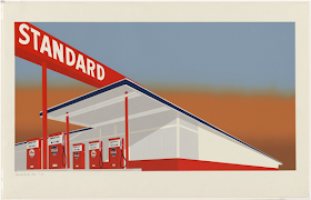
When Ruscha moved from the darkroom to his studio to make screen prints, he reduced what he called the "polished newness" of this Standard Station to its geometric and commercial essentials. As with Hopper, there are no automobiles and no customers.  The melancholy feeling of Hopper's Gas is replaced here with an exuberant but possibly ironic expression of postwar optimism.  In place of the beckoning darkness of the road vanishing to the right in Hopper's painting, we have strong diagonals converging at the right, emphasizing the simple geometry and the over-scaled signage. Details like landscaping and surrounding buildings, reflections in glass, and outward signs of interior space are omitted. There's no room for a brooding attendant at the pumps here.  Pop Art is just around the next corner in the unseen road...
It turned out there was danger around the corner too. Alfred Hitchcock's The Birds, released in spring of 1963, the same year as Ruscha's "Twentysix Gasoline Stations", was not in the ironic spirit of Pop Art. Instead, it was a fairly conventional (for Hitchcock) adaptation of Daphne du Maurier's story about an unexplained attack by wild birds on the inhabitants of a small town. Hitchcock filmed many scenes in and around the coastal Northern California town of Bodega Bay. Here, an attack on a customer at the gas pump leads to a chain of mishaps ending in a huge conflagration...
Today, the notion that we might worry about fires triggered by wild birds seems almost as quaint as the gas prices listed outside the doomed Capitol Oil Co.  With nine of the ten worst California wildfires having occurred since 2003, we have shifted our focus to droughts and fires resulting from climate change, itself related to use of fossil fuels. If we're nervous about wild birds at all, it's because we fear they may become extinct...
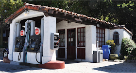
There were, at last count, around 168,000 gas stations in the United States, though their numbers have been reduced in recent years by declining profit margins, and also by zoning and environmental regulations which have restricted locations.  Few of these stations look like this one, built in the 1930s on Highway 1 in Carmel Highlands, California.  Like Edward Hopper's imaginary station, it sits at a transition, as the last vestige of townscape gives way to the wildness of the coastal highlands and the forests of Big Sur.  It may be a good place to rest before pondering the transition from gasoline-powered vehicles to what comes next.

*Song Credit:
"The Stories of the Street", copyright by Leonard Cohen, 1967.

Photo Credits:
Top & 3rd from top:  moma.org
2nd: artdepict.com 
4th: npr.org
5th: moma.org
6th: gasbuddy.com
7th: bodegabay.com
8th & 9th: roadarch.com