In 1969, the third and final year that new Star Trek episodes aired on TV, and the year after Stanley Kubrick's "2001: A Space Odyssey" mesmerized audiences in movie theaters, Charles Haertling* produced his exuberantly futuristic design for the Boulder Valley Eye Clinic, just north of Boulder's downtown on Broadway. It was also the year that NASA first landed men on the moon. So there was plenty of science in the air, to go along with the science fiction...
But, as anyone who's been following the "Jetsons in Boulder" series knows, Charles Haertling already had plenty of futurism in his thinking. The year he designed the eye clinic, he had seen construction completed of the Brenton House*, with its mushroom-like roof forms becoming walls and curving under floors. The Brenton would be featured in Woody Allen's "Sleeper" in 1973. Here in the eye clinic, Haertling found another reason to employ curves, with the "open eye" of the waiting area inviting the visitor back to the examining rooms, with their cantilevered pods containing the eye charts. These are visible as the four projecting forms with sloping bases in the first photo, and on the right (east) side of the plan below. These pods shade our view across Broadway in the above photo. Two pods repeat the same function on the west. Note the way the architect has provided landscaped spaces with trees and shrubs, partly enclosed by curving landscape walls, to shield offices and lounge from views of the parking.
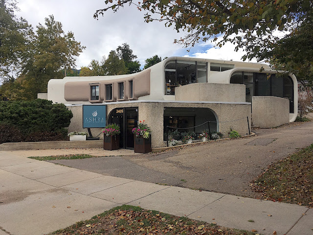
Sadly, when the building changed function to office space, someone decided the cantilevered eye chart pods needed to be removed and replaced with windows outlined in a darker color. It's too bad the building couldn't remain an eye clinic; the plan and forms were so specifically tailored to that purpose...
Here we see the Broadway side of the building as it appears today...
Below, at the south-facing, public entry of the clinic, the portion that looks like an opening eye in plan, we note what might have seemed a reassuring, regular pattern to the clinic's first customers: a series of regularly-spaced, circular concrete columns supporting the roof, and framing glass walls and the entry doors, which are marked "2401 Broadway". This may have been the only conventional message anywhere in the scheme, other than a parking lot sized to fit the vast "standard size" cars common in 1969...
Moving around what would be the southwest corner, if the building had anything like corners, we note the sculptural way roof and walls are joined by cascading curves, and the way these curves are repeated in plan and elevation.
As a look at the plan at the top shows, there were originally two cantilevered modules on the west side of the building that mirrored the shape and function of those on the east. Moving around to the west side, we see that like those on the front elevation, these modules have now been sheared off, and replaced by an arrangement of windows that looks like an afterthought. The building has served a number of different functions after its years of service as an eye clinic; these have included an architect's office and a fitness center. In its original form it could still function effectively as an eye clinic; when I visited the eye doc recently I noticed despite all the digital connectivity he still uses the same old system of charts to assess vision, but without any elegant cantilevered pods...
Moving around to the north driveway that connects back to Broadway, we can see how the roof forms roll down into the walls, and how the walls curve inward at the ground plane. This view is enough to make anyone wish that all utility lines could be submerged below that ground plane...
Despite being detoured from the original function that helped to generate its purposeful forms, and despite being saddled with some ill-considered signage and a two-tone color scheme, Haertling's building still works its sculptural magic on anyone who will spend a few moments walking around it. Like those works of science fiction produced in the same era, its form and content still have something to offer to a changing, troubled world.
*Footnote: For earlier photo essays devoted to Charles Haertling's architecture, see "The Jetsons at Home in Boulder, Colorado", posted on June 13, 2016, and "The Jetsons in Boulder Part 2: Charles Haertling Masterworks", from July 2, 2016. "The Jetsons in Boulder Part 3: Charles Haertling at Mid-Century and Beyond" appeared on June 30, 2020, and we had a look at Haertling's futuristic mountain work in "The Jetsons in Boulder Part 5: Hidden Gems in the Foothills", posted December 8, 2020. Part 4 of the Jetsons series was devoted to a building which is now a dental clinic, but was originally an architect's studio; please see "The Jetsons in Boulder Part 4: Roger Easton's Modest Masterpiece---Lightness and Facts on the Ground", posted October 12, 2020.
Photo Credits
All color photos are by the author. All monochrome photos are from the Boulder Carnegie Library for Local History Collection. The building plan by Charles Haertling was reproduced at pinterest.com.


No comments:
Post a Comment